
“Where” App Improvements
MY ROLES
UX RESEARCHER
UX DESIGNER
PRODUCT TESTING
Context
“Where” is an app designed for individuals who frequently cannot recall the whereabouts of their things. It helps manage users’ stuff by annotating them on the room photos using different coloured tag. This project aims to iterate on Where’s functionalities, adding two features to better let Where serve its target users.

Problem Statement
I’m myself a frequent Where user. Where really helped me a lot as when I place a thing somewhere in my room I can easily mark it down so I don’t forget where I placed it later. However, I found two issues related to Where’s design. First, it didn’t have a search function, meaning that if I had a lot of things in my room I would have to scroll down a long, long list to find one thing, which would waste a lot of time. Second, Where will become completely useless if I take an item out and forget to place it back later after use.
User Personas
I believe I’m not the only one who experiences these issues. As a result, I don’t want to design just for myself, but for many other people. After researching, I found that people who have a busy lifestyle and people who have neurodegenerative diseases might experience the same issues. I also wanted to design the features for them. Below are the personas I created for these groups of people.


Design Goals and Strategies
In order to address the two issues, I’m adding two features to Where. First, I’m adding an Item Search function to help users quickly identify the whereabout of an item among many other things. Second, I’m adding an item reminder function. This function reminds users to place the taken items back to where they were after a set period of time, so that users can always find the same thing next time.

Low-Fidelity Prototype: Item Search
The item search function is integrated into the item list page. Users can scroll down at the top side of the item list page to reveal the search bar.

Low-Fidelity Prototype: Item Reminder
Scenario 1: User chooses not to set up a reminder
For the item reminder function, I visualised four scenarios which are illustrated below. The first scenario is that user highlights the taken out items, but selects to not set up a reminder for the items.

Scenario 2: User sets up a reminder, but chooses not to place anything back when reminded
The second scenario is that user sets up a reminder for the taken items, but hasn’t finished using any item when reminded.
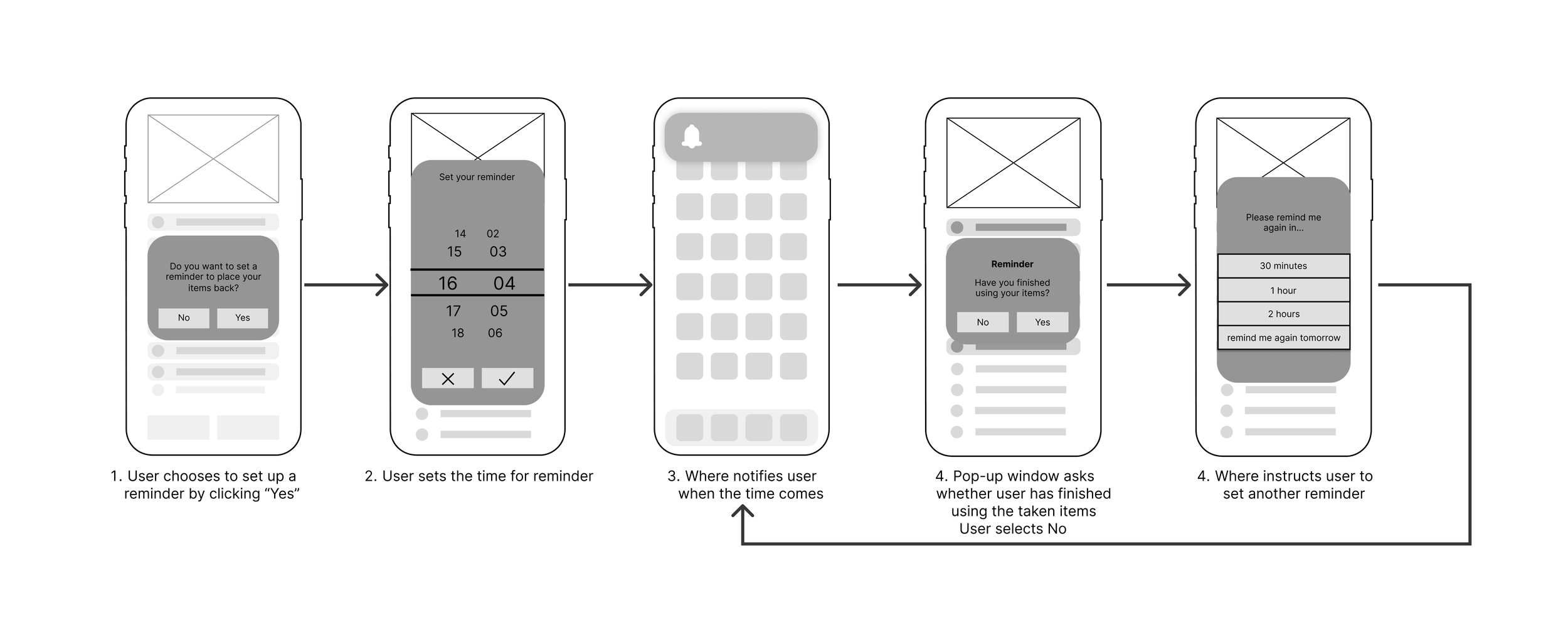
Scenario 3: User sets up a reminder, but puts only part of the items back when reminded
The third scenario is that user sets up a reminder for the taken items, but has only finished using part of the items when reminded.

Scenario 4: User sets up a reminder and puts all items back when reminded
The fourth scenario is that user sets up a reminder for the taken items and finishes using everything when reminded.

User Testing
I presented my low-fidelity prototype to 3 participants for user testing. Participants went through the interactions of all scenarios and gave feedback. Critically, their comments were:
Using only highlight to indicate taken items doesn’t feel intuitive enough.
“
The interface for taken items should be improved for easier interactions.
“
Pop-up reminder’s content should be tailored to specific scenarios.
“

I then collected my users’ feedback and reflected the improvements in the high-fidelity prototype.
High-Fidelity Prototype: Item Search

High-Fidelity Prototype: Item Reminder
For the Item Reminder function, the high-fidelity prototype integrated the user feedback and several improvements have been made.
Scenario 1: User chooses not to set up a reminder
I added a “Taken” text in bright green colour in addition to using highlights to indicate items taken out to more intuitively let users see their taken items.
Compared to the low-fidelity prototype, I pinned the taken items on top in the high-fidelity prototype so users can more conveniently interact with the taken items.

Scenario 2: User sets up a reminder, but chooses not to place anything back when reminded

Scenario 3: User sets up a reminder, but puts only part of the items back when reminded
The pop-up window now will show different messages to users based on their actions. For example, if user chooses “No” when Where asks them whether they’ve finished using taken items, Where would display “Please remind me again to place the items back in…”. However, if user chose yes but didn’t swipe everything highlighted items before tapping “Done”, Where would display “Please remind me again to place the rest of the items back in…”

Scenario 4: User sets up a reminder and puts all items back when reminded

Reflections
Always Ask Users
Sometimes we use certain designs for certain features because we think that’s the most intuitive way. However, that’s not how users actually think, but only “what we think the users think”. Users might not be able to get the point at all. For example, using highlights to mark items in this project was problematic because some users didn’t understand what it meant. I learned that the most intuitive design is always the design validated by real users.
Tiny Improvements Can Make a Huge Difference
The features we design might not be huge, but it is as tiny as these implementations that better address user pain points and requirements, and make a product even better. For my project, the Item Reminder functions is a tiny improvement, but it effectively addresses the issue of “forgetting to place an item back to the tagged location after use”, which makes Where a more powerful tool for people who often forget their items’ whereabouts.